Total Pageviews

Sunday, May 29, 2011

The Myth of Dollar Cost Averaging?

Okay, there are times when one has to deliver bad news and this is one of them.  It’s a long believed and taught methodology that cost averaging into the stock market is a wise decision.  The reason this is thought to be true makes partial sense.  Say for instance that I have just won 100.000 Euro in the Lottery.  That’s about $140,000 dollars in U.S. currency in today’s exchange rates.  My financial advisor says, don’t invest it all at once but put 10.000 in the market each month for 10 months.  For American readers, in Europe they use commas where we use periods and vice versa for denoting numbers in powers of one thousand. 
Now, the reasoning of this strategy makes sense to most of us, because we are told, if you invest 10.000 each month into some company or mutual fund and the shares that month say are 1.000 you buy 10 shares.  Next month if the share price drops 10% to 900, you’d buy 11.11 shares (if you could buy partial shares like for a mutual fund instead of some stock).  Then if in the month after you invest 10.000 when the share price rose to say 1.100 you buy 9.09 shares and so on.  The net effect is that you’d be buying more shares when the price is lower and less shares when the price is higher so that on average you be getting the shares for less than the average price over the course of 10 months. 
Now, this is all true and of course you get the same result when using this example in dollars.  However, this only measures the average share price you obtained the stock/mutual fund for.  It does not measure the effect of total wealth based on the return the investment offers you, which to you as an investor is what you really care about.  Unfortunately, the net wealth obtained from this strategy is path dependent.  That is, the net wealth depends upon the history of the return over the investing period of your investment horizon, 10 months in this example. 
To prove this to myself I ran a half million Monte Carlo simulations for three distinct return strategies.  One where the average return over the 12 months was zero, one where it was biased toward slightly negative returns and one where it was biased to slightly higher returns over the period of investing.  A single simulation went like this.  I generated random returns over 250 days where each day could have a random return selected between -5% and 5% and everywhere in between.  For each 250 day period, I cost averaged 12 investments equally spaced of a single dollar.  I measured the cumulative return of this strategy.  I also invested $12 dollars all at once in the beginning of the 250 day period and measured its return.  I then compared the difference between the two strategies.  I did this for 500,000, 250 day periods. 
Then I did the identical experiment where the returns were randomly selected between -5.5% and 5%, to get a slightly negative overall return bias then again for returns selected randomly between -5% and 5.5% to obtain the slightly positive return bias.  I tabulated the returns and the time-series of returns and show the chart below documenting the results.  The average returns were  -0.25%, 0% and 0.25% across all half million returns, but the paths to obtain these average returns varied.
Now to help the reader understand these results, I draw your attention to the numbers highlighted in yellow in the chart below.  This is the mean and median return difference between cost averaging (DCA) and lump sum investing for each of the three sets of simulations.  Take the first experiment where we had a positive bias in the returns.  In this scenario, the difference is negative meaning that if you have a positive return over the investing horizon, you’d obtain $24 out of your original $12 investment and the dollar cost averaging would have offered only $18 on your investment (on average) over the time period of the investment horizon.  Hence, the difference is negative here and lump sum investing wins.


The next experiment in the middle of the chart shows that you’d have obtained about the same returns for each strategy (within numerical error).  Now look too the last chart where returns have a negative bias now.  Here, the cost averaging method wins because you would suffer less losses over time, keeping some of your investment in cash while markets are going down.  If you had invested the lump sum all at once in the beginning of the investment period here, you’d have more money subjected to negative returns and hence less wealth at the end of the investment horizon.
These numbers are unarguable about the path dependence of returns that determines whether cost averaging or lump sum investing is the better issue.  Of course when saving for retirement, one has no choice but to cost average into your retirement investment.  I haven’t met an employer yet who said on day one of employment, “here’s your 30 years salary in one lump sum payment”, so 401(k) is a savings plan everybody should avail oneself of regardless. 
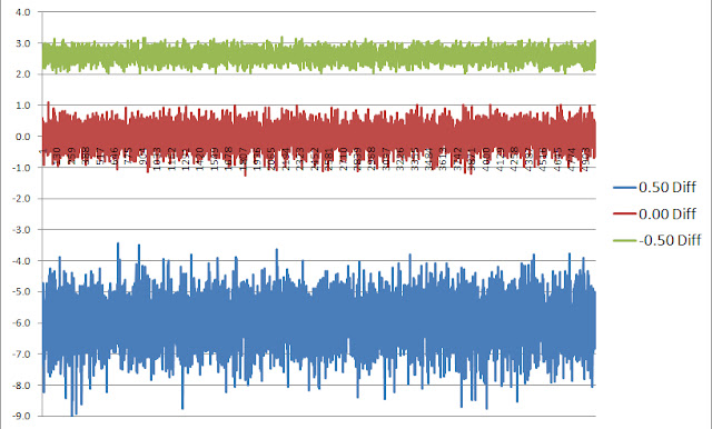
These numbers hide the time-series of returns of course over the 500,000 simulations because we only show average values and its enlightening to examine those returns due to the breadth or dispersion of values around the mean numbers.  The chart below plots the 500,000 (truncated) individual simulation difference between 250 day, 12 investment cost averaging strategy versus lump sum investing, for the positive bias in blue, the negative bias in green and the zero return strategy in red.


From this chart, one can see the much wider standard deviation of the positive bias (blue) outcomes than the negative bias (green) outcomes.  This is very meaningful so let me explain.  If the return over the investing horizon is positive, this example demonstrates that the possible return of lump sum investing over the cost averaging strategy could roughly be between 4% to 8%.  While if the returns are negatively biased by the same amount the returns were positively biased, the spread between the cost averaging beating lump sum investing is only between 2% to 3%, a much lower dispersion.  Due to the effect of compounding of returns, the path dependency impact of which one is the better strategy favors lump sum investing over cost averaging. 
So in conclusion, this means the amount you’d better lump sum investing by when returns are negative by cost averaging, is much less than the amount you’d win by lump sum investing when returns are positive by the same amount.  Since no one knows the future returns over the next investing horizon, it could be positive or negative, however the odds are in your favor to lump sum invest rather than cost average the lottery winnings simply because the gains you’d attain lump sum investing are much larger than the gain you’d attain cost averaging if returns are positive rather than negative.
Friday, May 13, 2011

What does $3 Trillion Dollars Buy the Chinese?

Let us spend a moment putting the significance of a few numbers in perspective, as it’s always easier to gauge the magnitude of a number when viewed collectively.  Like people’s heights, when somebody 5’6” is standing next to somebody 6’5”, it’s easier to grasp their values in comparative stricture. 
To begin, no number needs more transparency than the U.S. debt level.  First for comparison, the U.S. GDP these days runs around ~$15 Trillion dollars.  That’s $15,000,000,000,000 per year that our economy produces.   The U.S. debt is also of similar magnitude but with a sign change (-$14.7 Trillion) making the debt to GDP ratio about ~100%.  It’s 140% for Greece and over that for Japan.  The difference is Japan’s debt is 90% owned by its own people, whereas the U.S. debt is half owned by Americans, the other half is owned outside the U.S.  Now, the current budget deficit of POTUS (President of the United States) is around $1 Trillion if there are no cuts (there will be).  Which means that if this budget is passed by congress, it would raise the U.S. debt by a trillion in a single year, to $15,700,000,000,000, assuming of course that the debt ceiling is raised to accommodate it.  This amounts to ~$52,333 per person, very roughly. 
Now, the U.S. runs a trade deficit every year.  We actually run a trade surplus in services, but it’s the goods we trade in that run a deficit, meaning we import more goods than we export, however we do export consulting, filling out paperwork and general business services for other countries more than we take in but by far and away, buy more goods.  This deficit runs to -$668,000,000,000 per year or about -4.5% of GDP.  China on the other hand has a GDP of about 1/3 of the U.S. of about $5,000,000,000,000 per year, with a trade surplus of +$169,000,000,000 which is about 3.4% of their GDP.  However, nonetheless, moreover and but……. China has a surplus of foreign exchange reserves of $3,000,000,000,000 ($3 Trillion) whereas the U.S. has…..well, debt.  This $3 Trillion in reserves is 60% of their GDP. 
Now, this Chinese surplus is invested in over a trillion of U.S. Treasuries, meaning we owe the Chinese $1,000,000,000,000 minimally, probably more.  They on the other hand, have no interest in our dollar falling (devaluing) as it has been, as they’re investment is losing money when that happens.  Nor do the Chinese want the U.S. to default for then as a creditor, they won’t get paid dollar for dollar either.  So given the fear of that happening, what might the Chinese invest these proceeds in to diversify away from U.S. treasuries? 
Well, for one the entire amount of commercial mortgages owed in the U.S. collectively, is $2.4 Trillion.  Meaning the Chinese could pay the entire amount of listed mortgages on commercial real estate in the U.S. take a huge ownership in buildings and land here, and STILL have $600,000,000,000 leftover.  Oh by the way, the 2008 to 2010 loss in total real estate in this country was $8 Trillion just to put things in perspective.  China could also pay off the entire debt of Spain, Ireland, Portugal and Greece and still have $1,500,000,000,000 leftover, a full have of their surplus.  In addition, using this half of their surplus, they could buy all outstanding shares of Apple, Microsoft, IBM, Google and Exxon. 
Or they could spend the whole $3 Trillion and buy Exxon, Apple, GE, Microsoft, IBM, Chevron, Berkshire Hathaway, Walmart, AT&T, Proctor & Gamble, Johnson & Johnson, Oracle, JPMorgan and Google.  They’d spend all their money then but considering that on January 1st, their surplus was $2.85 Trillion and by the end of March it was $3 Trillion, after buying all these companies, by the end of next month, they’d have another $15,000,000,000 in cash to do something with.  Oh by the way, if they bought all the companies in the Russell 2000 index of small cap stocks, all 2000 of them, they’d still have $1.4 Trillion dollars left over, or $1,400,000,000,000! 
All of Manhattan’s taxable real estate amounts to just shy of $300 Billion.  China could by the whole Island and have over $2.5 Trillion dollars left!  We could throw in all the property of Washington D.C. for another $232 Billion and make them overpay and they’d still own Manhatten and D.C. and have $2 Trillion leftover!!   Understand, the total Tornado and Flood damage we hear about in the media recently amounts to somewhere between $5,000,000,000 to $6,000,000,000.  This is only ~0.18% of the Chinese surplus.  Consider that it would only cost about $1.9 Trillion to purchase all of the farmland in the U.S.  The Chinese could buy all our productive farmland and still have $1,100,000,000,000 leftover.
Now imagine in you will, an alternate universe in which the U.S. had a trade surplus of 60% of our GDP like the Chinese?  A whopping $9 Trillion dollars instead of -$14.7 Trillion in debt!  Who of us, would be worried about social security, health insurance and medicare under that circumstance?   Food for thought!

Tuesday, May 10, 2011

Is the World Running out of Commodities, a Second Look?

Recently I read a very thorough analysis of long term commodity prices from one of my favorite strategists which prompted my thinking about natural resources.  I ask the question and seek to answer if we’ve entered a new paradigm when it comes to world natural resource use and distribution?   This basic premise has to do with population growth, the rise of China and India and their consumption of resources at a scale the world has never known, sitting on top of the developed world’s continued use of materials and resources.   

For instance, as of 2010 China’s share of global consumption was:

Cement                       53.2%
Iron Ore                      47.7%
Coal                             46.9%
Pork                             46.4%
Steel                            45.4%
Lead                            44.6%
Zinc                             41.3%
Aluminum                  40.6%

And the list goes on as the world’s second largest economy continues to grow unabated….. 

Using oil as a data-point, from 1878 until 1971 oil hovered about $16/barrel +/- a small amount in today’s dollars.  However, from 1971 to the present, it rose precipitously and today it is not only at record levels, but has moved 6 standard deviation above $16 in today’s dollar terms. Brent Crude closed at $117.52 just this afternoon.  With so many other commodities performing the same way, is this demonstrative of a paradigm shift in global natural resource supply and demand?  To put a nail in the coffin on this idea, since 1994, one has to dig up an extra 50% of ore to get the same tonne of copper and this 150% effort has to be done using energy at 2 to 4 times the former price.

I read Jim Roger’s book, “Investment Biker” in 1997.  He had finished a motorcycle ride around the world and much of that book is a mini-summary of global economics.  He was the first person I heard, talk about the coming commodity boom and his visits to many developing countries during this trip convinced him the world would soon be needing tremendous amounts of raw materials.  We are seeing this come to pass.

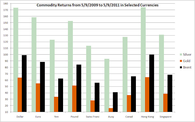
For the U.S., the purchasing power of the dollar continues to fall, especially relative to other currencies.  The following chart shows the return of Silver, Gold and Brent Crude from May of 2009 until now in various currencies.  Hong Kong currency represents the Yuan in this plot since the HKD is pegged to the dollar.  Notice however that measured in Swiss Francs, Australian and Canadian dollars, the appreciation of these three commodities hasn’t been nearly as severe as compared to what U.S. dollar consumers are paying (or earning on these commodity investments).  Is the fall of the dollar inviting demand for commodities as a hedge?


This run-up in prices hasn’t been missed and just before the credit crises of 2008 began, speculators took the media’s blame for the huge price increases even though the CFTC’s Interagency Task Force’s July 2008 Report on Crude Oil said:

The Task Force’s preliminary assessment is that current oil prices and the increase in oil prices between January 2003 and June 2008 are largely due to fundamental supply and demand factors. During this same period, activity on the crude oil futures market – as measured by the number of contracts outstanding, trading activity, and the number of traders – has increased significantly. While these increases broadly coincided with the run-up in crude oil prices, the Task Force’s preliminary analysis to date does not support the proposition that speculative activity has systematically driven changes in oil prices.

There have been other reports offering the same vindication that the fundamentals of supply and demand are changing such that price rises of commodities are due to shortages.  Currently corn stockpiles are at decade lows.  How can this have any other impact then that corn futures must rise, especially when growing middle class consumers in China, Indian, Vietnam and  Indonesia are hungering for more (historically) western styled foodstuffs?

The next chart documents commodity index price rises in energy, petroleum, industrial and precious metals, agriculture, livestock and softgoods.  Never before has the correlation across varying commodities been so high (i.e. all commodities moving lock-step in one direction, up!) other than during WWI and WWII’s when shortages abounded on a global scale.  Fortunately we’re not in a global war, but the cause is likely the same, global shortages of commodities.


Another point of reckoning has to do with the much larger availability of commodity ETF’s and mutual funds which are allowing the retail investor to participate in this asset class, where a decade ago, one had to buy physicals with ensuing storage problems or futures, both difficult for the retail market to handle.  In addition, the emergence of pension funds and institutional asset managers to make commodities part of their holdings too give’s credibility to the bull market in commodities as well as helps to keep prices higher by creating demand for the asset class.  Nevertheless, the demand whatever the cause means there’s more reason for commodities prices to continue to rise until this demand can be met.  The question I’m having a hard time answering is, will it?

Monday, May 2, 2011

Are the Days of Abundant Natural Resources Almost Over?


Recently I read a very thorough analysis of commodity prices from one of my favorite strategists, Jeremy Grantham of GMO.  In his April 2011 Quarterly Letter, he claims it’s time to wake up for the days of abundant resources and falling commodity prices are over forever.  In summary, Jeremy believes we’ve entered a new paradigm when it comes to world natural resources and in many ways it’s quite hard to argue.  His basic premise has to do with population growth, the rise of China and India and their consumption of resources at a scale the world has never known.   

For instance, as of 2010 China’s share of global consumption was:

Cement                        53.2%
Iron Ore                      47.7%
Coal                             46.9%
Pork                             46.4%
Steel                            45.4%
Lead                            44.6%
Zinc                             41.3%
Aluminum                    40.6%

And the list goes on…..He also analyzes oil and shows how from 1878 until 1971 oil hovered about $16/barrel +/- a small amount in today’s dollars.  However, from 1971 to the present, it rose precipitously and today it is not only at record levels, but has moved 6 standard deviation above $16 in today’s dollars.  This he concludes, along with many other commodities doing the same thing, is demonstrative of a paradigm shift in global natural resources supply and usage.  To put a nail in the coffin on this idea, he discusses copper where since 1994, one has to dig up an extra 50% of ore to get the same tonne of copper and this 150% effort has to be done using energy at 2 to 4 times the former price.

He then switches to discuss agriculture and talks about the easiest land masses for farming are already in use and that the planet has almost reached land capacity for agriculture use and that yield increases can only be accomplished due to more fertilizer and genetic engineering anymore.  Lastly, he discusses the ever optimistic American’s perspective that “we shall overcome” and why this isn’t going to solve our future problems.  Jeremy believes in sounding an alarm as to where things have gotten to and where they’re going.

I do believe he forgot several other important issues however.  Though the man has an excellent investment record and has been right many times before, the analysis of global supply and demand of materials and basic commodities is difficult to project.  It’s hard to nail these projections well for a single commodity let alone “all” commodities.  What he’s missing though isn’t good news unfortunately and only adds fuel to his fire.  It involves the debt to GDP ratios of most of the developed world.  He fails to mention it or talk about it much in this newsletter, but when you add this situation in the toxic stew, and throw in the fact that S&P recently issued a warning on U.S. treasury debt that it could be downgraded, you really get fearful. 

For all good reasons, the U.S. cannot grow very much for very long.  Therefore we can consider economic growth rates in the U.S. and Europe to stagnate at below 2% for some time, while the emerged economies of Asia continue to dominate growth and more and more account for greater percentages of world GDP.  Mr. Grantham’s last alarm is that even these economies of China, Brazil and India will have a stumble or two in the next few years and that in the longer future, beginning 2050 the depletion of natural resources will mean the globe will reach a level of mediocrity for our standard of living, implying we’ll all live at the mean.  I hope he’s not right.