Total Pageviews

Wednesday, December 21, 2011

Book Review by Ronald L. Moy, CFA

The roots of value investing can be traced back to the 1934 publication of Benjamin Graham and David Dodd’s classic, Security Analysis. Graham later disseminated his views to the general public in the highly regarded book The Intelligent Investor. The influence of Graham’s methodology is indisputable. His disciples represent a virtual who’s who of value investors, including Warren Buffett, Bill Ruane, and Walter Schloss. As a measure of his enduring impact on the field, a search of “Benjamin Graham” on Amazon.com yields more than 900 results concerning Graham’s writings and works about his investment philosophy. Given the success of the master and his students, it is no wonder that Graham remains an investor of immense interest to practitioners.
The title Ben Graham Was a Quant: Raising the IQ of the Intelligent Investor will probably cause readers to envision a book that traces Graham’s remarkable life and dissects his use of quantitative techniques that have become prevalent in modern finance. In reality, Steven P. Greiner has written a very different type of book. Greiner, the head of Risk Research for FactSet Research Systems, is the stereotypical Wall Street quant, holding a bachelor’s degree in mathematics and chemistry from the University of Buffalo and a PhD in physical chemistry from the University of Rochester. Greiner’s background in the hard sciences is evident in the quotations from either Albert Einstein or Isaac Newton at the beginning of nearly every chapter and in the author’s extensive use of examples from the hard sciences.
Throughout the book, Greiner pays homage to Graham, using his investment philosophy as the catalyst for examining quantitative investing. In the early chapters of the book, however, Greiner focuses mostly on his own view of quantitative investing. In spite of his strong quantitative background, he does a good job of making his ideas accessible to readers with a wide variety of backgrounds.
Greiner starts with a review of the history of quantitative investing. In most accounts, the story begins with Harry Markowitz’s seminal work on portfolio theory in 1952. For Greiner, however, the origins of quantitative investing date back earlier, to the work of Benjamin Graham. Greiner points out that Graham’s 1949 classic,The Intelligent Investor, lists seven criteria that defined the “quantitatively tested portfolio.” These criteria include such factors as the size of the enterprise, earnings stability, financial condition, dividend record, earnings growth, price-to-earnings ratio, and price-to-book ratio. As Greiner points out, the definition of a quant as someone who designs and implements mathematical models for the pricing of securities does not mention the use of a computer.
As the pages go by, the link between Graham’s methodology and quantitative analysis becomes clearer. Chapters 4–6 begin to delve into the quantitative factors that Graham used in formulating his investment philosophy. Throughout these chapters, Greiner tests the empirical validity of Graham’s factors with a Fama–French type of model. Greiner criticizes the factors used by many MBAs that are linked to academic theories but may have no empirical validity. He writes, “Empiricism suggests the main drivers of stock returns are often market trading forces more than business financials.” In testing Graham’s model, Greiner finds that such factors as book-to-price ratio, price-to-earnings ratio, and dividend yield do extremely well in predicting performance.
Using the Graham factors, Greiner goes on to build a factor model for predicting returns. Because he cannot confer with Graham on which factors to include in the model, Greiner does not use stepwise regression to identify the best ones. Rather, he elects to use all the factors in order to remain true to the Graham methodology. Throughout the book, Greiner provides numerous tables and graphs to document the effectiveness of the Graham factors in predicting security returns and to support the fundamental tenet of the book—that empiricism should trump theory in modeling security returns.
Greiner saves the most technical material for the end. Stochastic portfolio theory is introduced in Chapter 9 as an alternative to the modern portfolio theory traditionally taught in graduate schools. Greiner begins with an example of fractals to introduce the reader to the concept of scaling and then moves into the area of stochastic modeling and the Ito equation. Breaking the Ito equation down into two components, drift and variance, allows Greiner to show when to favor different investment methodologies. If the drift component dominates the variance component, then momentum investing (i.e., the Graham method) will produce solid returns. If the variance component dominates the drift component, then contrarian strategies will work well.
The book ends with a digression that is part history, part political commentary, and part foreshadowing of what is to come. Not surprisingly, Greiner provides evidence from the hard sciences on the importance of using empiricism to support theory. He begins the final chapter with a discussion of the theories of gravity devised by Newton and Einstein and the solar eclipse in 1919 that allowed researchers to empirically verify Einstein’s calculation. The inability of modern portfolio theory to explain the internet bubble of 1999–2000 again provides Greiner with the impetus to search elsewhere for new and empirically relevant models. Although few have been able to predict bubbles, Greiner finds a French physicist, Didier Sornette, whose model has been remarkably accurate in predicting them. Sornette’s work leads to a prediction of a market bubble in China, which motivates a discussion of the Chinese economy and its long-run impact on the U.S. economy. Greiner examines the financial crisis in the United States and then provides an un-quant-like discussion of the complicity of the U.S. government in causing the crisis. Greiner concludes with a discussion of the future of quantitative investing. He suggests that numbers may be replaced by qualitative information that can be used to create quantitative measures and advises aspiring quants to study Chinese, physics, and statistics to deal with this new world order.
Although his title is a bit misleading, Greiner has produced a well-written book. Despite being somewhat disjointed, it makes effective use of Benjamin Graham’s investment methodology to introduce such concepts as alpha, the Sharpe ratio, and the Fama–French model. His ability to describe quantitative techniques without overusing difficult esoteric equations allows those with more modest mathematical sophistication to access the concepts used by quants. All in all,Ben Graham Was a Quant is a rewarding read for those who desire a glimpse into the world of quant investing.
—R.L.M.
Tuesday, November 1, 2011

Global One Sentence Summary


The U.S. stock market is not cheap, but only just about average in terms of long term valuations.  Stocks are cheap relative to U.S. treasuries however, because the Fed is purposefully keeping interest rates soooo low punishing savers, rewarding borrowers.  Which cannot be good long term simply because that’s the Greenspan playbook which put us in this situation in the first place.  So, this means that stocks valuations only look cheap relative to bonds simply due to the artificial low bond rates, which means stocks aren’t cheap.

Unless the U.S, EU and the developed world lowers their long term debts and runs “handilable” (is that a word?) yearly fiscal deficits we’re all screwed.  Long term growth will be paltry, unemployment will remain high and GPD growth(s) will be less than 2%.   If the developed world does fix their debt/deficit problems, it’ll still won’t happen quickly and stubborn unemployment and low growth will stick around for 3 more years anyway….

China has some debt problems too due to over-leveraging of land/real estate by local govts’ and their banks having more bad non-performing loans than they’ll admit to.  They also pay cheap interest rates to savers allowing their banks to borrow-short, lend-long more favorably then they ought.  But, they have the equivalent of 2/3rd’s (~66%) of their annual GDP in surplus.  Imagine if the U.S. had $10 trillion in surplus what it’d be like?  …and their surplus is still growing just like the U.S. debt…growing oppositely… China’s 9% growth rate will slow to 6% but will remain > 3 x ours..  Then, Malaysia, Phillipines, Vietnam, Singapore, Thailand, Hong Kong…. All still going great guns with little debt, balanced fiscal situations, cheap labor, growing middle class.

Then, all 12 Australian’s and 6  Canadians are becoming rich due to BOOMING resource development and growing exporters… Their currencies are safe havens.

In a one sentence summary though, the future is still Asia….

Wednesday, August 17, 2011

Taxing the Rich

We heard recently that even the old sage of Omaha is recommending that we raise taxes on his buddies, that is, the truly rich. Well first, Mr. Buffet makes most of his income from his investments, not salary. In which case, his income has already been taxed twice since it comes from dividends and capital gains which are taxed at 15%, after these monies have already been taxed at the corporate rate of 35% before distribution, hence the overall tax rate on these monies is approaching more like 40% to 45%. This double taxation is a competitive disadvantage to U.S corporations as few other countries employ this tactic, let alone tax monies earned overseas and left there too.

Nevertheless to enter this debate, we must first realize that President Obama wants to increase income taxes on those making $200,000 or more a year, not just on those who are multi-millionaires and billionaires. So let’s ask the question, just who are these people with above average earnings, but not truly rich? We can download from the IRS website (http://www.irs.gov/taxstats/indtaxstats/html) almost any kind of tax data we want, so from the IRS Statistics of Income 2011 we can tabulate some interesting data for 2009, as the data compilation is two years in arrears. The table below has in it all we need to describe these “criminals” we need to tax more from.


In this chart we show on the first column the income categories followed by the number of filed returns, the amount of income for each cohort and the percentage of income of the total these categories compile.  These are all highlighted in green.  Toward the bottom of the chart we approach the truly rich, the millionaires and multi-millionaires.  So those “criminals” who earn $10 million or more a year, they take home 4.2% of all U.S. income but compile just 0.01% of the population.  Mr. Buffet falls into this category. 
However, in brown we highlight their tax liability and payments.  Those same people, those criminals who earn that much money, already pay 26.3% of all income tax (2nd column from right).  In addition, they only pay over $6 million each!  They’re criminals anyway so we should just confiscate all of their income!  I hope you see my sarcasm. 
The question that needs to be asked, is “what is the rich’s fair share?”  Seriously if you think about it, if ~30% of the bulk of U.S. income tax paid by the rich isn’t fair, what should it be?  From these tables, the rich already pay more than the rest of us so what I ask is, what’s fair?  The truly rich comprise 0.01% of the population, have 4.2% of the income and pay 6.2% of all income tax while paying 26.3% of their income in tax individually.   Contrast that with those earning between $75K and $100K who comprise 13.4% of the population, earn 13.4% of all income and pay 9.3% of total U.S. income tax but only 12.3% of their income in tax personally.  Further, those earning between $30K and $40K comprise 11.7% of the population, earn 4.16% of total U.S. income and contribute just 2.33% of all tax while paying 10% of their income in tax.
Oh, by the way, we’re such a polite society, we can see that those who earn between $20,000 and $25,000 a year pay 8.7% of their income in taxes individually, while comprising 5.6% of the population and earning 0.78% of U.S. total income.  But when we really want to know who pays the most tax, the IRS informs us, it is those who earn between $200,000 and $10 million, they pay almost a full one-third of their income in taxes and contribute 29.1% of ALL U.S. INCOME TAX receipts. 
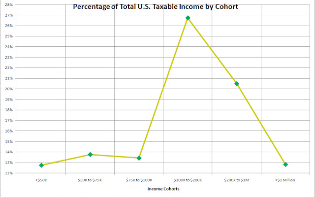
Now, another way to look at this data is to remove the granularity which we show in this next plot of the percentage of U.S. income by just six categories of income.  This is the chart below.

Here we can exactly why President Obama wants to increase the taxes on those earning $200,000 a year and that reason is because that’s where the money is.  From this chart, almost 27% of all income is between those making $100K to $200K and over 20% earn between $200K to $1Million dollars a year.  Just like the outlaw Jesse James who robbed banks because that’s where the money is, so our tax policy is moving in the same direction.  But are those earning $100K the rich?  Hardly.
From the data the IRS so politely made available, we can delve in and plot a bar-chart of the % of taxable income (green) and % of tax paid as a function of income (red bar).  The next chart illustrates this very well.  From this dataset, we can see that the majority of Americans earn between ~$75,000 and $500,000 a year.  That is where the bulk of the green bars demonstrate the highest percentage of tax payers income is from.  In essence then, this defines the 2009 middle class.  First, it’s unbelievable to me that a family earning $350,000 a year for instance is in the middle class these days, but that’s what the data says.  If your income is in the middle of the data, you’re middle class.  A reason for this is due to the devaluation of the U.S. dollar so that $350,000 a year today is more like $150,000 in 1995.  It’s just not a lot of money anymore when a regular, not a fancy house, costs more than that today in most major cities.
However from this data set, look at where the majority of taxes come from?  This is seen by the tall red bars beginning on the right side of the chart.  Notice that beginning at $500,000 a year in income, the percentage of tax paid moves from 15%-16% of income to over 24% and it increases from there.  The huge majority of total U.S. income tax is born already by the “rich”.  If in this country you’re lucky enough to make an income above the middle class, you also obtain the right to pay the majority of the tax.  It’s a great deal for the rest of us on the bottom of the income scale!


When we begin to ask, “it’s a great deal for whom?”  We can answer that with a clip obtained from recent a WSJ editorial shown below.


As we already “soak the rich”, the payout to those on the left side of these charts, those on the lower income side of the equation also receive more and more of these taxes in entitlements and such.  In essence the transfer and redistribution of wealth already occurs in this country using the existing tax policies, let alone the new taxes the government wants to impose on us all.  If you’re middle class, watch your pocket book and the best way to do that is to pay attention to those you’re voting for.

Wednesday, August 3, 2011

Some Truths about the National Debt and Raising the Debt Ceiling

There’s a lot of misrepresentation about the national debt in the media in terms of its size and significance. In addition, many people confuse the budget deficit with the national debt. The budget deficit in lay-terms represents a single year’s difference in income (from taxes) versus government spending, while the national debt represents the amount of accumulated debt from budget deficits over many years. In addition, I observe that many people believe that raising the debt ceiling, simply because it’s been done before in other administrations is a “good thing” and should be a “no brainer”.

I believe what’s missing in these arguments is a historical perspective about the U.S. national debt. It’s not so much a fault of “POTUS” per-se (i.e. Bush vs. Obama) as it is about a general failure of our congress, senate and the sitting president to understand the economic underpinnings of what has been occurring over many years, over many sitting presidents. Moreover, in the past raising the debt ceiling was easy when the debt to GDP ratio was small.

To help the reader understand this issue, consider if you have income of $50,000 per year and have a credit card limit of $10,000 while simultaneously having $5000 in credit card debt. In this situation, you’d have a debt to income ratio of 10% ($5000/$50,000, if that was all the debt you had). Now, let us say you go on vacation and spend some more via credit card and come home with another $5000 spent, raising your debt level to $10,000. Now you’ve reached your credit limit and have 20% debt to income. If you job is secure and you’ve had it for many years you can call your bank and ask them to raise your credit limit to $15,000 and they probably would. This can go on of course until your debt to income level approaches some limit. The argument about your debt ceiling, your credit card limit of course will get more and more heated until finally the bank says, “no more credit” and stops raising your limit.

Now, what is the acceptable credit limit you might ask in percentage of income terms? Is it 20%, 40%, certainly it’s not 100%. If you have $50,000 of credit card debt with 10% interest rate and only a $50,000 income, the credit card debt service will begin to eat away your take home pay each month. So it’s logical to have a credit limit to protect you from yourself, to protect you from paying too much money in interest card debt service, so that you will not have to declare bankruptcy, so you will not have to default on your debt. However, now consider if your income is growing at 10% a year so that next year you’re income will be $55,000. Then your debt to income ratio will fall simply because your income went up, not because your debt decreased. Eventually in this way you’d stay financially and fiscally sound because your income growth will wear down your debt. For a nation, there are two ways to mimic this trend. The obvious way is to increase your GDP (i.e. grow your economy) and the non-obvious way is to devalue your currency. More about this later.

This analogy makes it all easy to understand. Now, consider in this example some country. What is the appropriate amount of debt to income, or debt to GDP to have before this country goes bust and defaults on its debt? To put this in a global perspective, the following chart offers a list of countries that most of us recognize their debt as a percentage of GDP as collected by the International Monetary Fund (IMF) and the date of the data. Now, you hear in the media these days about Europe’s wows from the PIIGS (Portugal, Ireland, Italy, Greece and Spain) countries which I rename the GIIPS as I find PIIGS insulting. I highlight in bright yellow these countries. I also highlight Japan and the U.S. in beige so you can compare the debt to GDP of Japan and the U.S. with the GIIPS countries that are travailing Europe these days. So when you hear people say, “the U.S. is just like Greece”, you can see why they say that. Their debt to GPD is 130% while the U.S. is approaching 100% (it’ll surpass 100% this year). Italy, Ireland, Iceland are all just a little bit ahead of the U.S. and Portugal is just behind us.


Spain is way below the U.S. Now France is up there as is Belgium along with some smaller countries most of us don’t care too much about. However so is Singapore. Singapore is an example though where their GDP is growing so fast that they’ll stay ahead of their debt, analogous to the 10% income growth of the individual I spoke about. But the other countries all have low single digit GDP growth and some negative growth. That is where the debt to GDP ratio becomes important for when the debt to GDP ratio becomes large like the U.S. which grew from 40% in 1980 to ~100% now, the credit rating agencies (the equivalent of banks for the personal credit card holder) begin to lose confidence the country (and individual) can make debt payments regularly so buyers of our debt begin to demand higher interest rates to purchase new debt just like the credit card agencies will raise the interest rate on your credit, your debt. Thus, if the 3% interest rates the U.S. pays on its debt to creditors rises to 5% or 6%, the amount of money paid each year to creditors doubles which leaves less for the government to operate, less for Medicare, less for road construction, less for pensions and so forth. This is why maintaining the investment grade AAA rating on U.S. is so important, to keep the cost of paying the debt manageable.

So we see that Japan has really high debt to GDP and also we know that their economy has stalled. So the impact of high debt is also that it slows the economy and wreaks havoc with growth of employment, growth of business and lowers the general earnings of everybody. Now Japan can sustain higher levels of debt simply because most of their owners are the Japanese themselves, while the U.S. has a much higher incidence of foreign buyers of our debt. Thus when Japan pays interest on its debt to its debt holders, it mostly goes to the Japanese people while the when the U.S. pays interest on its it mostly goes overseas, to the Chinese, Indians and resource rich countries found in the middle east. These are the major buyers of our debt, hence the media talks about the Chinese loaning us money. Indeed they are.

Now, let’s look at the increase of our national debt through time where we earmark which president was in office for the particular increase. The following chart illustrates this perfectly but unfortunately doesn’t take us into 2011, that is the full impact of debt borrowing this year isn’t added into the Obama years of 2011.


First we note the strong rise in debt under Bush II. Clearly the wars of Iraq and Afghanistan meant we had to raise more funds to run these wars among other things. It appears that both Bush’s have quite the steep slope in rising debt, but we call attention to a subtlety missed by most of us. When “W” took office the national debt was $5.768 trillion and when he left office eight years later it was $10.626 trillion amounting to $607 billion per year of debt increase. However, the debt when Obama took office at $10.626 now stands at $14.071 trillion in just two years. This is a whopping $1.723 trillion per year for Obama. We can argue all day long about whether he had to do it, was left with a lousy economy by Bush II (W) or not, but the facts are under his administration the largest debt increase in the history of the U.S. occurred amounting to $3.445 trillion in just two years!! These are the facts. Another way of looking at this involves observing the debt to GDP through time as opposed to just debt growth. The next plot illustrates this nicely.


Here we show the debt levels as the red bars (axis on the left) and the debt to GDP as the blue line (axis on the right). Now, this chart isn’t up-to-date with the debt to GDP levels currently as it was produced at the 6th year of the Bush II term so estimates shown as the light bars to the right aren’t what really occurred during the Obama years. So the data is only accurate to the end of the bright red bars on the right in the year 2007. At that time period, the debt to GDP was only 65% to 66%. Thus one can clearly see that raising the debt ceiling at that time or before that time it wasn’t such a significant request from congress as the debt was manageable since it was a smaller percentage of GDP. We as a nation raised enough through taxes to service the debt and still run the government.

Now however, given the data I quoted above, from 2007 to 2011 or debt to GDP has risen to 100% and we’re in danger of not being able to afford the debt payments which makes the request of congress to raise the debt ceiling are more important issue. In addition, yet for all that increase in debt which pushes our debt to GDP to 100% are economy is stalling, unemployment remains persistently high and our future is “mortgaged” due to all this debt. Hence the reason many in congress see this persistent trend, started by Bush II but exacerbated by Obama as making the U.S. face up to this day of reckoning. The debt to GPD has reached a level which is unsustainable and that’s what all the fuss is about.

The last chart pin-points where the U.S. is on a world map dividing into rising debt, rising deficit to lowering debt, lowering deficits. Countries with rising debt and rising single year deficit spending are shown in the upper right. This includes the U.S. and Japan and is the worst situation to be in. Countries like Greece, Spain, Portugal and France fare better because while they have huge debt, they are shrinking their spending. Healthy countries like Sweden, Korea and Switzerland are shown below the horizontal like and have balanced budgets and little debt. These make good countries to live in right now.


In conclusion, the issue about the debt ceiling debates in congress has little to do with whose right democrats or republicans, Obama versus Boehner when you take into account the global situation and the historical perspective. It has everything to do with basic fundamental economics whence you know the facts. We in the U.S. just cannot afford “everything”. Even we need to curtail spending and stop growing our debt in perpetuity. The solution will involve devaluing our currency, making our debt smaller relative to other currencies and curtailing spending by cutting welfare and entitlement programs like Medicare, govt pension and social security while raising some taxes. There is no other way. Unfortunately this means unemployment will remain stubborn highly for some time and economic growth will be muted also for just as long. Meanwhile, if more regulation and more growth in the size of government occurs then we will have no choice but to take the “Greecian” formula for ourselves.

Friday, July 1, 2011

Ben Graham Quants Live!!!!

There was a lot of smoke and mirrors blowing immediately after the credit crisis looking for sources of blame.  A book that made a lot of press was “The Quants” by Scott Patterson.  Mr. Patterson was a WSJ reporter and clearly has a flare for the imaginative and while “The Quants” makes what is normally a quite dry subject (like accounting or actuarial science), an easy read and adds adventure to the quant story, there’s much in it that’s inaccurate, hyperbole and well, probably made up.  Like the conversation between a waiter and Cliff Asness, and Peter Muller and Ken Griffin bickering.  I mean, he presents their dialogue like a David Baldacci novel’s characters, fun, but highly fictional!
One of the main themes of the book however is really about how Wall Street whiz kids brought the house down because with their impetuous, brilliant and extremely aggressive nature, they made their fortunes by robbing less intelligent clients and their investors.  While other quants using badly mis-specified models based on the normal curve (specifying default correlation among bonds for instance), underpriced risk and contributed to huge losses for the banks.   If you took both exaggerations and divided them by 10, you’d probably reach something nearer the truth while the overall pain of losses was spread pretty much across all quants (except John Paulson) and non-quants during the credit crisis.
However, one good takeaway is that the book makes you think about whether quants have learned anything about major market turns and whether they’ve adapted their models and modeling techniques to consider the impact of “Obsidian Uncertainties” (i.e. formally Black Swans) and ELE events.  The answer to that question is a stark “YES”.   The first example of it comes with UCITS mandating VaR requirements for EU mutual funds to less than 4 breeches per year at 99% CI.  In 250 trading days, 2.5 breeches of the 99% VaR is right on target.  UCITS mandate therefore is a signal to quants to “tighten up” and FactSet’s Balanced Risk model considers that target specifically. 
Another good example comes from the increasing usage of stress-testing one’s portfolio against variables that could move your portfolio toward larges losses.  Thus, it’s no longer sufficient to create an Alpha model based on back-testing through turbulent periods alone, so now quants are examining their quantitatively derived portfolio behaviors by using covariance matrices from the past to forecast the risk from credit crises, LTCM debacles, Asian contagion security dependencies and so forth all of which involve situations where idiosyncratic risks take a back-seat to market risks in a major way.
Crises events are characterized by factor efficacy falling-off considerably while securities increase their correlation as well.  When that has happened in the past, quants used to hold firm and wait for the correlative nature of the markets to return to pre-crisis levels and this stocks “de-correlation” meant factor efficacy was returning.  Now however, quants have learned that these periods may persist for long periods of time and that one way of prepping your portfolio for these events is to examine forecasted risks from short horizon risk models (~1 year of daily values).  In this way, turning or inflection points of the market are more quickly spotted than using a long horizon risk model (~60 months) and adjustments to the portfolio can occur by rotating more quickly to factor bets that are more efficacious in the new environment.
The tricky part is, adaptation in one’s overall investment strategy due to market conditions is exactly what Ben Graham taught us not to do.  During the technology bubble for instance, many value investors moved more toward growth only to go out of business when the bubble burst, besides introducing enough style drift that consultants fired them for that reason alone.  Ben Graham’s philosophy is about maintaining investment process discipline and not reacting to the whims of Mr. Market.  However, for the truly post-modern quant, adaptation is the discipline.  From the quant’s perspective, application of the Ben Graham principles to the investment process is about adhering to risk mitigation “come hell or high water”.  It’s about providing the portfolio with a margin of safety through the methods available in the quantitative art.  The credit crises has truly allowed quants to leverage their methods and think about risk in new ways.  This indeed has raised the IQ of the intelligent quantitative manager.

Sunday, May 29, 2011

The Myth of Dollar Cost Averaging?

Okay, there are times when one has to deliver bad news and this is one of them.  It’s a long believed and taught methodology that cost averaging into the stock market is a wise decision.  The reason this is thought to be true makes partial sense.  Say for instance that I have just won 100.000 Euro in the Lottery.  That’s about $140,000 dollars in U.S. currency in today’s exchange rates.  My financial advisor says, don’t invest it all at once but put 10.000 in the market each month for 10 months.  For American readers, in Europe they use commas where we use periods and vice versa for denoting numbers in powers of one thousand. 
Now, the reasoning of this strategy makes sense to most of us, because we are told, if you invest 10.000 each month into some company or mutual fund and the shares that month say are 1.000 you buy 10 shares.  Next month if the share price drops 10% to 900, you’d buy 11.11 shares (if you could buy partial shares like for a mutual fund instead of some stock).  Then if in the month after you invest 10.000 when the share price rose to say 1.100 you buy 9.09 shares and so on.  The net effect is that you’d be buying more shares when the price is lower and less shares when the price is higher so that on average you be getting the shares for less than the average price over the course of 10 months. 
Now, this is all true and of course you get the same result when using this example in dollars.  However, this only measures the average share price you obtained the stock/mutual fund for.  It does not measure the effect of total wealth based on the return the investment offers you, which to you as an investor is what you really care about.  Unfortunately, the net wealth obtained from this strategy is path dependent.  That is, the net wealth depends upon the history of the return over the investing period of your investment horizon, 10 months in this example. 
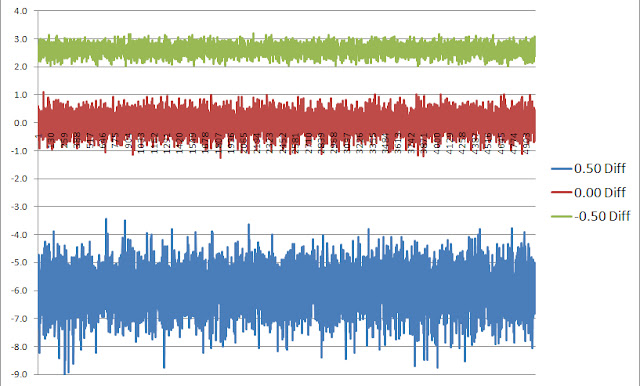
To prove this to myself I ran a half million Monte Carlo simulations for three distinct return strategies.  One where the average return over the 12 months was zero, one where it was biased toward slightly negative returns and one where it was biased to slightly higher returns over the period of investing.  A single simulation went like this.  I generated random returns over 250 days where each day could have a random return selected between -5% and 5% and everywhere in between.  For each 250 day period, I cost averaged 12 investments equally spaced of a single dollar.  I measured the cumulative return of this strategy.  I also invested $12 dollars all at once in the beginning of the 250 day period and measured its return.  I then compared the difference between the two strategies.  I did this for 500,000, 250 day periods. 
Then I did the identical experiment where the returns were randomly selected between -5.5% and 5%, to get a slightly negative overall return bias then again for returns selected randomly between -5% and 5.5% to obtain the slightly positive return bias.  I tabulated the returns and the time-series of returns and show the chart below documenting the results.  The average returns were  -0.25%, 0% and 0.25% across all half million returns, but the paths to obtain these average returns varied.
Now to help the reader understand these results, I draw your attention to the numbers highlighted in yellow in the chart below.  This is the mean and median return difference between cost averaging (DCA) and lump sum investing for each of the three sets of simulations.  Take the first experiment where we had a positive bias in the returns.  In this scenario, the difference is negative meaning that if you have a positive return over the investing horizon, you’d obtain $24 out of your original $12 investment and the dollar cost averaging would have offered only $18 on your investment (on average) over the time period of the investment horizon.  Hence, the difference is negative here and lump sum investing wins.


The next experiment in the middle of the chart shows that you’d have obtained about the same returns for each strategy (within numerical error).  Now look too the last chart where returns have a negative bias now.  Here, the cost averaging method wins because you would suffer less losses over time, keeping some of your investment in cash while markets are going down.  If you had invested the lump sum all at once in the beginning of the investment period here, you’d have more money subjected to negative returns and hence less wealth at the end of the investment horizon.
These numbers are unarguable about the path dependence of returns that determines whether cost averaging or lump sum investing is the better issue.  Of course when saving for retirement, one has no choice but to cost average into your retirement investment.  I haven’t met an employer yet who said on day one of employment, “here’s your 30 years salary in one lump sum payment”, so 401(k) is a savings plan everybody should avail oneself of regardless. 
These numbers hide the time-series of returns of course over the 500,000 simulations because we only show average values and its enlightening to examine those returns due to the breadth or dispersion of values around the mean numbers.  The chart below plots the 500,000 (truncated) individual simulation difference between 250 day, 12 investment cost averaging strategy versus lump sum investing, for the positive bias in blue, the negative bias in green and the zero return strategy in red.


From this chart, one can see the much wider standard deviation of the positive bias (blue) outcomes than the negative bias (green) outcomes.  This is very meaningful so let me explain.  If the return over the investing horizon is positive, this example demonstrates that the possible return of lump sum investing over the cost averaging strategy could roughly be between 4% to 8%.  While if the returns are negatively biased by the same amount the returns were positively biased, the spread between the cost averaging beating lump sum investing is only between 2% to 3%, a much lower dispersion.  Due to the effect of compounding of returns, the path dependency impact of which one is the better strategy favors lump sum investing over cost averaging. 
So in conclusion, this means the amount you’d better lump sum investing by when returns are negative by cost averaging, is much less than the amount you’d win by lump sum investing when returns are positive by the same amount.  Since no one knows the future returns over the next investing horizon, it could be positive or negative, however the odds are in your favor to lump sum invest rather than cost average the lottery winnings simply because the gains you’d attain lump sum investing are much larger than the gain you’d attain cost averaging if returns are positive rather than negative.

Friday, May 13, 2011

What does $3 Trillion Dollars Buy the Chinese?

Let us spend a moment putting the significance of a few numbers in perspective, as it’s always easier to gauge the magnitude of a number when viewed collectively.  Like people’s heights, when somebody 5’6” is standing next to somebody 6’5”, it’s easier to grasp their values in comparative stricture. 
To begin, no number needs more transparency than the U.S. debt level.  First for comparison, the U.S. GDP these days runs around ~$15 Trillion dollars.  That’s $15,000,000,000,000 per year that our economy produces.   The U.S. debt is also of similar magnitude but with a sign change (-$14.7 Trillion) making the debt to GDP ratio about ~100%.  It’s 140% for Greece and over that for Japan.  The difference is Japan’s debt is 90% owned by its own people, whereas the U.S. debt is half owned by Americans, the other half is owned outside the U.S.  Now, the current budget deficit of POTUS (President of the United States) is around $1 Trillion if there are no cuts (there will be).  Which means that if this budget is passed by congress, it would raise the U.S. debt by a trillion in a single year, to $15,700,000,000,000, assuming of course that the debt ceiling is raised to accommodate it.  This amounts to ~$52,333 per person, very roughly. 
Now, the U.S. runs a trade deficit every year.  We actually run a trade surplus in services, but it’s the goods we trade in that run a deficit, meaning we import more goods than we export, however we do export consulting, filling out paperwork and general business services for other countries more than we take in but by far and away, buy more goods.  This deficit runs to -$668,000,000,000 per year or about -4.5% of GDP.  China on the other hand has a GDP of about 1/3 of the U.S. of about $5,000,000,000,000 per year, with a trade surplus of +$169,000,000,000 which is about 3.4% of their GDP.  However, nonetheless, moreover and but……. China has a surplus of foreign exchange reserves of $3,000,000,000,000 ($3 Trillion) whereas the U.S. has…..well, debt.  This $3 Trillion in reserves is 60% of their GDP. 
Now, this Chinese surplus is invested in over a trillion of U.S. Treasuries, meaning we owe the Chinese $1,000,000,000,000 minimally, probably more.  They on the other hand, have no interest in our dollar falling (devaluing) as it has been, as they’re investment is losing money when that happens.  Nor do the Chinese want the U.S. to default for then as a creditor, they won’t get paid dollar for dollar either.  So given the fear of that happening, what might the Chinese invest these proceeds in to diversify away from U.S. treasuries? 
Well, for one the entire amount of commercial mortgages owed in the U.S. collectively, is $2.4 Trillion.  Meaning the Chinese could pay the entire amount of listed mortgages on commercial real estate in the U.S. take a huge ownership in buildings and land here, and STILL have $600,000,000,000 leftover.  Oh by the way, the 2008 to 2010 loss in total real estate in this country was $8 Trillion just to put things in perspective.  China could also pay off the entire debt of Spain, Ireland, Portugal and Greece and still have $1,500,000,000,000 leftover, a full have of their surplus.  In addition, using this half of their surplus, they could buy all outstanding shares of Apple, Microsoft, IBM, Google and Exxon. 
Or they could spend the whole $3 Trillion and buy Exxon, Apple, GE, Microsoft, IBM, Chevron, Berkshire Hathaway, Walmart, AT&T, Proctor & Gamble, Johnson & Johnson, Oracle, JPMorgan and Google.  They’d spend all their money then but considering that on January 1st, their surplus was $2.85 Trillion and by the end of March it was $3 Trillion, after buying all these companies, by the end of next month, they’d have another $15,000,000,000 in cash to do something with.  Oh by the way, if they bought all the companies in the Russell 2000 index of small cap stocks, all 2000 of them, they’d still have $1.4 Trillion dollars left over, or $1,400,000,000,000! 
All of Manhattan’s taxable real estate amounts to just shy of $300 Billion.  China could by the whole Island and have over $2.5 Trillion dollars left!  We could throw in all the property of Washington D.C. for another $232 Billion and make them overpay and they’d still own Manhatten and D.C. and have $2 Trillion leftover!!   Understand, the total Tornado and Flood damage we hear about in the media recently amounts to somewhere between $5,000,000,000 to $6,000,000,000.  This is only ~0.18% of the Chinese surplus.  Consider that it would only cost about $1.9 Trillion to purchase all of the farmland in the U.S.  The Chinese could buy all our productive farmland and still have $1,100,000,000,000 leftover.
Now imagine in you will, an alternate universe in which the U.S. had a trade surplus of 60% of our GDP like the Chinese?  A whopping $9 Trillion dollars instead of -$14.7 Trillion in debt!  Who of us, would be worried about social security, health insurance and medicare under that circumstance?   Food for thought!

Tuesday, May 10, 2011

Is the World Running out of Commodities, a Second Look?

Recently I read a very thorough analysis of long term commodity prices from one of my favorite strategists which prompted my thinking about natural resources.  I ask the question and seek to answer if we’ve entered a new paradigm when it comes to world natural resource use and distribution?   This basic premise has to do with population growth, the rise of China and India and their consumption of resources at a scale the world has never known, sitting on top of the developed world’s continued use of materials and resources.   

For instance, as of 2010 China’s share of global consumption was:

Cement                       53.2%
Iron Ore                      47.7%
Coal                             46.9%
Pork                             46.4%
Steel                            45.4%
Lead                            44.6%
Zinc                             41.3%
Aluminum                  40.6%

And the list goes on as the world’s second largest economy continues to grow unabated….. 

Using oil as a data-point, from 1878 until 1971 oil hovered about $16/barrel +/- a small amount in today’s dollars.  However, from 1971 to the present, it rose precipitously and today it is not only at record levels, but has moved 6 standard deviation above $16 in today’s dollar terms. Brent Crude closed at $117.52 just this afternoon.  With so many other commodities performing the same way, is this demonstrative of a paradigm shift in global natural resource supply and demand?  To put a nail in the coffin on this idea, since 1994, one has to dig up an extra 50% of ore to get the same tonne of copper and this 150% effort has to be done using energy at 2 to 4 times the former price.

I read Jim Roger’s book, “Investment Biker” in 1997.  He had finished a motorcycle ride around the world and much of that book is a mini-summary of global economics.  He was the first person I heard, talk about the coming commodity boom and his visits to many developing countries during this trip convinced him the world would soon be needing tremendous amounts of raw materials.  We are seeing this come to pass.

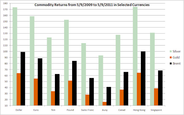
For the U.S., the purchasing power of the dollar continues to fall, especially relative to other currencies.  The following chart shows the return of Silver, Gold and Brent Crude from May of 2009 until now in various currencies.  Hong Kong currency represents the Yuan in this plot since the HKD is pegged to the dollar.  Notice however that measured in Swiss Francs, Australian and Canadian dollars, the appreciation of these three commodities hasn’t been nearly as severe as compared to what U.S. dollar consumers are paying (or earning on these commodity investments).  Is the fall of the dollar inviting demand for commodities as a hedge?


This run-up in prices hasn’t been missed and just before the credit crises of 2008 began, speculators took the media’s blame for the huge price increases even though the CFTC’s Interagency Task Force’s July 2008 Report on Crude Oil said:

The Task Force’s preliminary assessment is that current oil prices and the increase in oil prices between January 2003 and June 2008 are largely due to fundamental supply and demand factors. During this same period, activity on the crude oil futures market – as measured by the number of contracts outstanding, trading activity, and the number of traders – has increased significantly. While these increases broadly coincided with the run-up in crude oil prices, the Task Force’s preliminary analysis to date does not support the proposition that speculative activity has systematically driven changes in oil prices.

There have been other reports offering the same vindication that the fundamentals of supply and demand are changing such that price rises of commodities are due to shortages.  Currently corn stockpiles are at decade lows.  How can this have any other impact then that corn futures must rise, especially when growing middle class consumers in China, Indian, Vietnam and  Indonesia are hungering for more (historically) western styled foodstuffs?

The next chart documents commodity index price rises in energy, petroleum, industrial and precious metals, agriculture, livestock and softgoods.  Never before has the correlation across varying commodities been so high (i.e. all commodities moving lock-step in one direction, up!) other than during WWI and WWII’s when shortages abounded on a global scale.  Fortunately we’re not in a global war, but the cause is likely the same, global shortages of commodities.


Another point of reckoning has to do with the much larger availability of commodity ETF’s and mutual funds which are allowing the retail investor to participate in this asset class, where a decade ago, one had to buy physicals with ensuing storage problems or futures, both difficult for the retail market to handle.  In addition, the emergence of pension funds and institutional asset managers to make commodities part of their holdings too give’s credibility to the bull market in commodities as well as helps to keep prices higher by creating demand for the asset class.  Nevertheless, the demand whatever the cause means there’s more reason for commodities prices to continue to rise until this demand can be met.  The question I’m having a hard time answering is, will it?

Monday, May 2, 2011

Are the Days of Abundant Natural Resources Almost Over?


Recently I read a very thorough analysis of commodity prices from one of my favorite strategists, Jeremy Grantham of GMO.  In his April 2011 Quarterly Letter, he claims it’s time to wake up for the days of abundant resources and falling commodity prices are over forever.  In summary, Jeremy believes we’ve entered a new paradigm when it comes to world natural resources and in many ways it’s quite hard to argue.  His basic premise has to do with population growth, the rise of China and India and their consumption of resources at a scale the world has never known.   

For instance, as of 2010 China’s share of global consumption was:

Cement                        53.2%
Iron Ore                      47.7%
Coal                             46.9%
Pork                             46.4%
Steel                            45.4%
Lead                            44.6%
Zinc                             41.3%
Aluminum                    40.6%

And the list goes on…..He also analyzes oil and shows how from 1878 until 1971 oil hovered about $16/barrel +/- a small amount in today’s dollars.  However, from 1971 to the present, it rose precipitously and today it is not only at record levels, but has moved 6 standard deviation above $16 in today’s dollars.  This he concludes, along with many other commodities doing the same thing, is demonstrative of a paradigm shift in global natural resources supply and usage.  To put a nail in the coffin on this idea, he discusses copper where since 1994, one has to dig up an extra 50% of ore to get the same tonne of copper and this 150% effort has to be done using energy at 2 to 4 times the former price.

He then switches to discuss agriculture and talks about the easiest land masses for farming are already in use and that the planet has almost reached land capacity for agriculture use and that yield increases can only be accomplished due to more fertilizer and genetic engineering anymore.  Lastly, he discusses the ever optimistic American’s perspective that “we shall overcome” and why this isn’t going to solve our future problems.  Jeremy believes in sounding an alarm as to where things have gotten to and where they’re going.

I do believe he forgot several other important issues however.  Though the man has an excellent investment record and has been right many times before, the analysis of global supply and demand of materials and basic commodities is difficult to project.  It’s hard to nail these projections well for a single commodity let alone “all” commodities.  What he’s missing though isn’t good news unfortunately and only adds fuel to his fire.  It involves the debt to GDP ratios of most of the developed world.  He fails to mention it or talk about it much in this newsletter, but when you add this situation in the toxic stew, and throw in the fact that S&P recently issued a warning on U.S. treasury debt that it could be downgraded, you really get fearful. 

For all good reasons, the U.S. cannot grow very much for very long.  Therefore we can consider economic growth rates in the U.S. and Europe to stagnate at below 2% for some time, while the emerged economies of Asia continue to dominate growth and more and more account for greater percentages of world GDP.  Mr. Grantham’s last alarm is that even these economies of China, Brazil and India will have a stumble or two in the next few years and that in the longer future, beginning 2050 the depletion of natural resources will mean the globe will reach a level of mediocrity for our standard of living, implying we’ll all live at the mean.  I hope he’s not right.      

Wednesday, March 30, 2011

Where Should the Enterprising Investor Focus These Days?

In my book "Ben Graham Was a Quant; Raising the IQ of the Intelligent Investor" in Chapter 8, I state that if Ben Graham was an active investor today, his recipe for success would probably include some other pertinent factors we should include or consider in the wake of our current economy being dominated by financial companies and the service-based sector.  Similarly, in Chapter 6, I state that “empiricism suggests the main drivers of stock returns are often market trading forces more than underlying business financials, especially in down markets when fear is leading the investment decisions rather than fundamentals.” 

Well, what I believe is probably most important to add at this time is leverage or quality ratios.  The flight from leverage in 2008 was really extreme and you saw the bounce back in 09.  Most quant models in practice, especially when predicated on regression back-tests favor value and quality (not value or quality).  Hence most traditional value investor’s holdings typically are also of higher quality and they didn’t participate in the 09 performance rebound (as much) unless they were “value only” investors of which few are.  The “value and quality” paradigm exists because value factors are so intrinsically implemented in the most quant models directly but quality simply because of its correlation with out-performance.  That is, in the cross-section of returns, those that out-perform most through time are those that tend to get the capital structure most right and those not highly leveraged are found in the top fractiles.

Secondly, Credit Default Swaps came out in 1998 I believe, and capital structure arb player Hedge Funds’s started shortly thereafter.  That has meant a slow but steady increase in correlation between the corporate bond market and equities.  Thus, it seems to me that a prescient activity for fundamental equity investors should involve getting a better understanding of the underlying debt/asset ratios and look for value predicated on the intrinsic value of the equity.  Cutting on these factors may not identify buy candidates but they will identify candidate stocks to avoid.

Now in down markets when fear is leading the charge of influence of stock return, stocks disconnect from fundamentals.  Thus, buying low volatility (low g-Factor, low Beta) stocks when the VIX is increasing is a good strategy, as long as you sell them and buy high vol (high g-Factor, high Beta) stocks when the VIX is decreasing.  Thus, working with incorporating volatility into your strategy can pay dividends when minor ELE events are happening.  I believe in addition to paying attention to the corporate debt side of the equation, a lot can be garnered by studying the implied vol of a company’s option chain.  That gives the trader’s view of where the stock is going.

In terms of their weighting?   That’s difficult to say a bit unless one spends some time modeling the factors you uncover along these lines relevant to return.  Each investor must determine that for themselves.