Total Pageviews

Wednesday, August 17, 2011

Taxing the Rich

We heard recently that even the old sage of Omaha is recommending that we raise taxes on his buddies, that is, the truly rich. Well first, Mr. Buffet makes most of his income from his investments, not salary. In which case, his income has already been taxed twice since it comes from dividends and capital gains which are taxed at 15%, after these monies have already been taxed at the corporate rate of 35% before distribution, hence the overall tax rate on these monies is approaching more like 40% to 45%. This double taxation is a competitive disadvantage to U.S corporations as few other countries employ this tactic, let alone tax monies earned overseas and left there too.

Nevertheless to enter this debate, we must first realize that President Obama wants to increase income taxes on those making $200,000 or more a year, not just on those who are multi-millionaires and billionaires. So let’s ask the question, just who are these people with above average earnings, but not truly rich? We can download from the IRS website (http://www.irs.gov/taxstats/indtaxstats/html) almost any kind of tax data we want, so from the IRS Statistics of Income 2011 we can tabulate some interesting data for 2009, as the data compilation is two years in arrears. The table below has in it all we need to describe these “criminals” we need to tax more from.


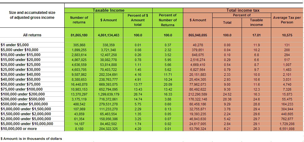
In this chart we show on the first column the income categories followed by the number of filed returns, the amount of income for each cohort and the percentage of income of the total these categories compile.  These are all highlighted in green.  Toward the bottom of the chart we approach the truly rich, the millionaires and multi-millionaires.  So those “criminals” who earn $10 million or more a year, they take home 4.2% of all U.S. income but compile just 0.01% of the population.  Mr. Buffet falls into this category. 
However, in brown we highlight their tax liability and payments.  Those same people, those criminals who earn that much money, already pay 26.3% of all income tax (2nd column from right).  In addition, they only pay over $6 million each!  They’re criminals anyway so we should just confiscate all of their income!  I hope you see my sarcasm. 
The question that needs to be asked, is “what is the rich’s fair share?”  Seriously if you think about it, if ~30% of the bulk of U.S. income tax paid by the rich isn’t fair, what should it be?  From these tables, the rich already pay more than the rest of us so what I ask is, what’s fair?  The truly rich comprise 0.01% of the population, have 4.2% of the income and pay 6.2% of all income tax while paying 26.3% of their income in tax individually.   Contrast that with those earning between $75K and $100K who comprise 13.4% of the population, earn 13.4% of all income and pay 9.3% of total U.S. income tax but only 12.3% of their income in tax personally.  Further, those earning between $30K and $40K comprise 11.7% of the population, earn 4.16% of total U.S. income and contribute just 2.33% of all tax while paying 10% of their income in tax.
Oh, by the way, we’re such a polite society, we can see that those who earn between $20,000 and $25,000 a year pay 8.7% of their income in taxes individually, while comprising 5.6% of the population and earning 0.78% of U.S. total income.  But when we really want to know who pays the most tax, the IRS informs us, it is those who earn between $200,000 and $10 million, they pay almost a full one-third of their income in taxes and contribute 29.1% of ALL U.S. INCOME TAX receipts. 
Now, another way to look at this data is to remove the granularity which we show in this next plot of the percentage of U.S. income by just six categories of income.  This is the chart below.

Here we can exactly why President Obama wants to increase the taxes on those earning $200,000 a year and that reason is because that’s where the money is.  From this chart, almost 27% of all income is between those making $100K to $200K and over 20% earn between $200K to $1Million dollars a year.  Just like the outlaw Jesse James who robbed banks because that’s where the money is, so our tax policy is moving in the same direction.  But are those earning $100K the rich?  Hardly.
From the data the IRS so politely made available, we can delve in and plot a bar-chart of the % of taxable income (green) and % of tax paid as a function of income (red bar).  The next chart illustrates this very well.  From this dataset, we can see that the majority of Americans earn between ~$75,000 and $500,000 a year.  That is where the bulk of the green bars demonstrate the highest percentage of tax payers income is from.  In essence then, this defines the 2009 middle class.  First, it’s unbelievable to me that a family earning $350,000 a year for instance is in the middle class these days, but that’s what the data says.  If your income is in the middle of the data, you’re middle class.  A reason for this is due to the devaluation of the U.S. dollar so that $350,000 a year today is more like $150,000 in 1995.  It’s just not a lot of money anymore when a regular, not a fancy house, costs more than that today in most major cities.
However from this data set, look at where the majority of taxes come from?  This is seen by the tall red bars beginning on the right side of the chart.  Notice that beginning at $500,000 a year in income, the percentage of tax paid moves from 15%-16% of income to over 24% and it increases from there.  The huge majority of total U.S. income tax is born already by the “rich”.  If in this country you’re lucky enough to make an income above the middle class, you also obtain the right to pay the majority of the tax.  It’s a great deal for the rest of us on the bottom of the income scale!


When we begin to ask, “it’s a great deal for whom?”  We can answer that with a clip obtained from recent a WSJ editorial shown below.


As we already “soak the rich”, the payout to those on the left side of these charts, those on the lower income side of the equation also receive more and more of these taxes in entitlements and such.  In essence the transfer and redistribution of wealth already occurs in this country using the existing tax policies, let alone the new taxes the government wants to impose on us all.  If you’re middle class, watch your pocket book and the best way to do that is to pay attention to those you’re voting for.

Wednesday, August 3, 2011

Some Truths about the National Debt and Raising the Debt Ceiling

There’s a lot of misrepresentation about the national debt in the media in terms of its size and significance. In addition, many people confuse the budget deficit with the national debt. The budget deficit in lay-terms represents a single year’s difference in income (from taxes) versus government spending, while the national debt represents the amount of accumulated debt from budget deficits over many years. In addition, I observe that many people believe that raising the debt ceiling, simply because it’s been done before in other administrations is a “good thing” and should be a “no brainer”.

I believe what’s missing in these arguments is a historical perspective about the U.S. national debt. It’s not so much a fault of “POTUS” per-se (i.e. Bush vs. Obama) as it is about a general failure of our congress, senate and the sitting president to understand the economic underpinnings of what has been occurring over many years, over many sitting presidents. Moreover, in the past raising the debt ceiling was easy when the debt to GDP ratio was small.

To help the reader understand this issue, consider if you have income of $50,000 per year and have a credit card limit of $10,000 while simultaneously having $5000 in credit card debt. In this situation, you’d have a debt to income ratio of 10% ($5000/$50,000, if that was all the debt you had). Now, let us say you go on vacation and spend some more via credit card and come home with another $5000 spent, raising your debt level to $10,000. Now you’ve reached your credit limit and have 20% debt to income. If you job is secure and you’ve had it for many years you can call your bank and ask them to raise your credit limit to $15,000 and they probably would. This can go on of course until your debt to income level approaches some limit. The argument about your debt ceiling, your credit card limit of course will get more and more heated until finally the bank says, “no more credit” and stops raising your limit.

Now, what is the acceptable credit limit you might ask in percentage of income terms? Is it 20%, 40%, certainly it’s not 100%. If you have $50,000 of credit card debt with 10% interest rate and only a $50,000 income, the credit card debt service will begin to eat away your take home pay each month. So it’s logical to have a credit limit to protect you from yourself, to protect you from paying too much money in interest card debt service, so that you will not have to declare bankruptcy, so you will not have to default on your debt. However, now consider if your income is growing at 10% a year so that next year you’re income will be $55,000. Then your debt to income ratio will fall simply because your income went up, not because your debt decreased. Eventually in this way you’d stay financially and fiscally sound because your income growth will wear down your debt. For a nation, there are two ways to mimic this trend. The obvious way is to increase your GDP (i.e. grow your economy) and the non-obvious way is to devalue your currency. More about this later.

This analogy makes it all easy to understand. Now, consider in this example some country. What is the appropriate amount of debt to income, or debt to GDP to have before this country goes bust and defaults on its debt? To put this in a global perspective, the following chart offers a list of countries that most of us recognize their debt as a percentage of GDP as collected by the International Monetary Fund (IMF) and the date of the data. Now, you hear in the media these days about Europe’s wows from the PIIGS (Portugal, Ireland, Italy, Greece and Spain) countries which I rename the GIIPS as I find PIIGS insulting. I highlight in bright yellow these countries. I also highlight Japan and the U.S. in beige so you can compare the debt to GDP of Japan and the U.S. with the GIIPS countries that are travailing Europe these days. So when you hear people say, “the U.S. is just like Greece”, you can see why they say that. Their debt to GPD is 130% while the U.S. is approaching 100% (it’ll surpass 100% this year). Italy, Ireland, Iceland are all just a little bit ahead of the U.S. and Portugal is just behind us.


Spain is way below the U.S. Now France is up there as is Belgium along with some smaller countries most of us don’t care too much about. However so is Singapore. Singapore is an example though where their GDP is growing so fast that they’ll stay ahead of their debt, analogous to the 10% income growth of the individual I spoke about. But the other countries all have low single digit GDP growth and some negative growth. That is where the debt to GDP ratio becomes important for when the debt to GDP ratio becomes large like the U.S. which grew from 40% in 1980 to ~100% now, the credit rating agencies (the equivalent of banks for the personal credit card holder) begin to lose confidence the country (and individual) can make debt payments regularly so buyers of our debt begin to demand higher interest rates to purchase new debt just like the credit card agencies will raise the interest rate on your credit, your debt. Thus, if the 3% interest rates the U.S. pays on its debt to creditors rises to 5% or 6%, the amount of money paid each year to creditors doubles which leaves less for the government to operate, less for Medicare, less for road construction, less for pensions and so forth. This is why maintaining the investment grade AAA rating on U.S. is so important, to keep the cost of paying the debt manageable.

So we see that Japan has really high debt to GDP and also we know that their economy has stalled. So the impact of high debt is also that it slows the economy and wreaks havoc with growth of employment, growth of business and lowers the general earnings of everybody. Now Japan can sustain higher levels of debt simply because most of their owners are the Japanese themselves, while the U.S. has a much higher incidence of foreign buyers of our debt. Thus when Japan pays interest on its debt to its debt holders, it mostly goes to the Japanese people while the when the U.S. pays interest on its it mostly goes overseas, to the Chinese, Indians and resource rich countries found in the middle east. These are the major buyers of our debt, hence the media talks about the Chinese loaning us money. Indeed they are.

Now, let’s look at the increase of our national debt through time where we earmark which president was in office for the particular increase. The following chart illustrates this perfectly but unfortunately doesn’t take us into 2011, that is the full impact of debt borrowing this year isn’t added into the Obama years of 2011.


First we note the strong rise in debt under Bush II. Clearly the wars of Iraq and Afghanistan meant we had to raise more funds to run these wars among other things. It appears that both Bush’s have quite the steep slope in rising debt, but we call attention to a subtlety missed by most of us. When “W” took office the national debt was $5.768 trillion and when he left office eight years later it was $10.626 trillion amounting to $607 billion per year of debt increase. However, the debt when Obama took office at $10.626 now stands at $14.071 trillion in just two years. This is a whopping $1.723 trillion per year for Obama. We can argue all day long about whether he had to do it, was left with a lousy economy by Bush II (W) or not, but the facts are under his administration the largest debt increase in the history of the U.S. occurred amounting to $3.445 trillion in just two years!! These are the facts. Another way of looking at this involves observing the debt to GDP through time as opposed to just debt growth. The next plot illustrates this nicely.


Here we show the debt levels as the red bars (axis on the left) and the debt to GDP as the blue line (axis on the right). Now, this chart isn’t up-to-date with the debt to GDP levels currently as it was produced at the 6th year of the Bush II term so estimates shown as the light bars to the right aren’t what really occurred during the Obama years. So the data is only accurate to the end of the bright red bars on the right in the year 2007. At that time period, the debt to GDP was only 65% to 66%. Thus one can clearly see that raising the debt ceiling at that time or before that time it wasn’t such a significant request from congress as the debt was manageable since it was a smaller percentage of GDP. We as a nation raised enough through taxes to service the debt and still run the government.

Now however, given the data I quoted above, from 2007 to 2011 or debt to GDP has risen to 100% and we’re in danger of not being able to afford the debt payments which makes the request of congress to raise the debt ceiling are more important issue. In addition, yet for all that increase in debt which pushes our debt to GDP to 100% are economy is stalling, unemployment remains persistently high and our future is “mortgaged” due to all this debt. Hence the reason many in congress see this persistent trend, started by Bush II but exacerbated by Obama as making the U.S. face up to this day of reckoning. The debt to GPD has reached a level which is unsustainable and that’s what all the fuss is about.

The last chart pin-points where the U.S. is on a world map dividing into rising debt, rising deficit to lowering debt, lowering deficits. Countries with rising debt and rising single year deficit spending are shown in the upper right. This includes the U.S. and Japan and is the worst situation to be in. Countries like Greece, Spain, Portugal and France fare better because while they have huge debt, they are shrinking their spending. Healthy countries like Sweden, Korea and Switzerland are shown below the horizontal like and have balanced budgets and little debt. These make good countries to live in right now.


In conclusion, the issue about the debt ceiling debates in congress has little to do with whose right democrats or republicans, Obama versus Boehner when you take into account the global situation and the historical perspective. It has everything to do with basic fundamental economics whence you know the facts. We in the U.S. just cannot afford “everything”. Even we need to curtail spending and stop growing our debt in perpetuity. The solution will involve devaluing our currency, making our debt smaller relative to other currencies and curtailing spending by cutting welfare and entitlement programs like Medicare, govt pension and social security while raising some taxes. There is no other way. Unfortunately this means unemployment will remain stubborn highly for some time and economic growth will be muted also for just as long. Meanwhile, if more regulation and more growth in the size of government occurs then we will have no choice but to take the “Greecian” formula for ourselves.